

Whizzkids rebrand
Working on the Whizzkids rebrand was such a fun and creative adventure! From brainstorming a new name to designing the mascot and logo, I got to explore lots of playful ideas while keeping the focus on technology, togetherness, and learning. I loved collaborating with the Whizzkids team and seeing their enthusiasm for every step of the process. In the following sections, I’ll take you through the journey—from the first sketches to the big reveal—and show how the brand came to life.
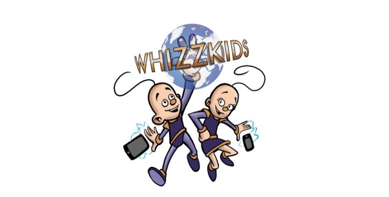
The former logo of whizzkids
What is Whizzkids?
Whizzkids is a voluntary organization made up of teachers who want to teach their students about the wonders of the internet and how to optimize its usage. They do this by providing internet quizzes and exercises on their website that are free for schools and teachers to use. To make the learning process more engaging and fun for both teachers and students, they also organize several contests in which entire classes can participate, helping to foster togetherness and learning in the classroom.
They offer fun prizes that classes can win, such as paid school trips, which are especially appealing for schools with lower incomes. The finals of the quizzes also take place during paid school trips to amusement parks. In the morning, there are extra interactive quizzes for the students, after which the classes can enjoy the rest of the park in the afternoon. At the end of the day, Whizzkids organizes a fun show to announce the winners of the quiz. These quizzes are therefore a great bonding experience for the participating schools.
They organize these quizzes for several target groups:
Primary school
High school A-stream
High school B-stream
Student teachers
the whizzkids team
Now that we have a quick understanding of who Whizzkids are, we will break down their requests for the new branding.
Make the brand more modern and contemporary.
Make the brand more engaging for all the different target groups.
Change the name to encompass different age groups (the word “kids” might be too focused on primary school students).
Introduce a new mascot or mascots to reflect their brand and focus on togetherness and technology.
For the new branding concept, I focused on the family and togetherness aspect. I also wanted to keep some elements from their former mascots, such as the little hair spiral, which is very iconic. The hair spiral reminded me of small alien antennas. Since the internet is often associated with “cyberspace,” I thought a space theme could be a good fit for Whizzkids. Space is strongly associated with technology and the future, making it a great match for the new branding.
First sketch of the “whizzies”
Meet the “Whizzies” – a group of aliens who are very curious about everything and everyone. Just like their little antennas suggest, they are brimming with questions and can’t wait to find the answers!
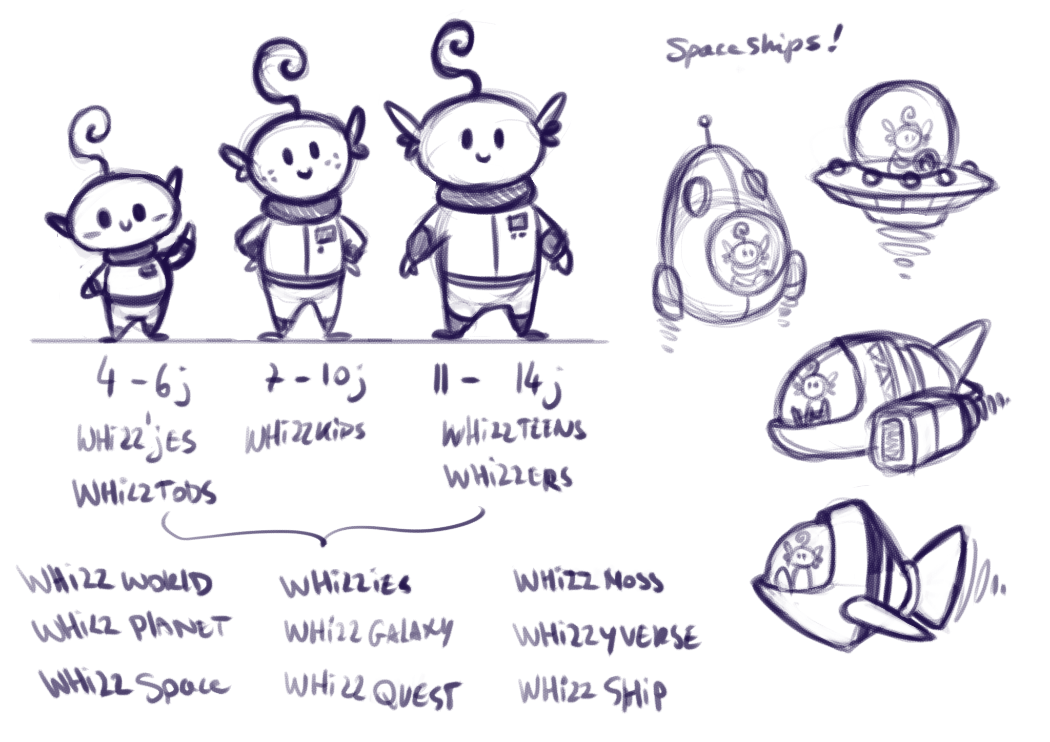
We have three types of Whizzies for the main target demographics:
Primary school ages 4–6
Primary school ages 7–10
High school students and adults
Since Whizzkids was still considering a name change, I suggested keeping the “whizz” part of the name so the new branding wouldn’t feel too jarring for their existing audience. This way, it would remain recognizable while still having a fresh twist.
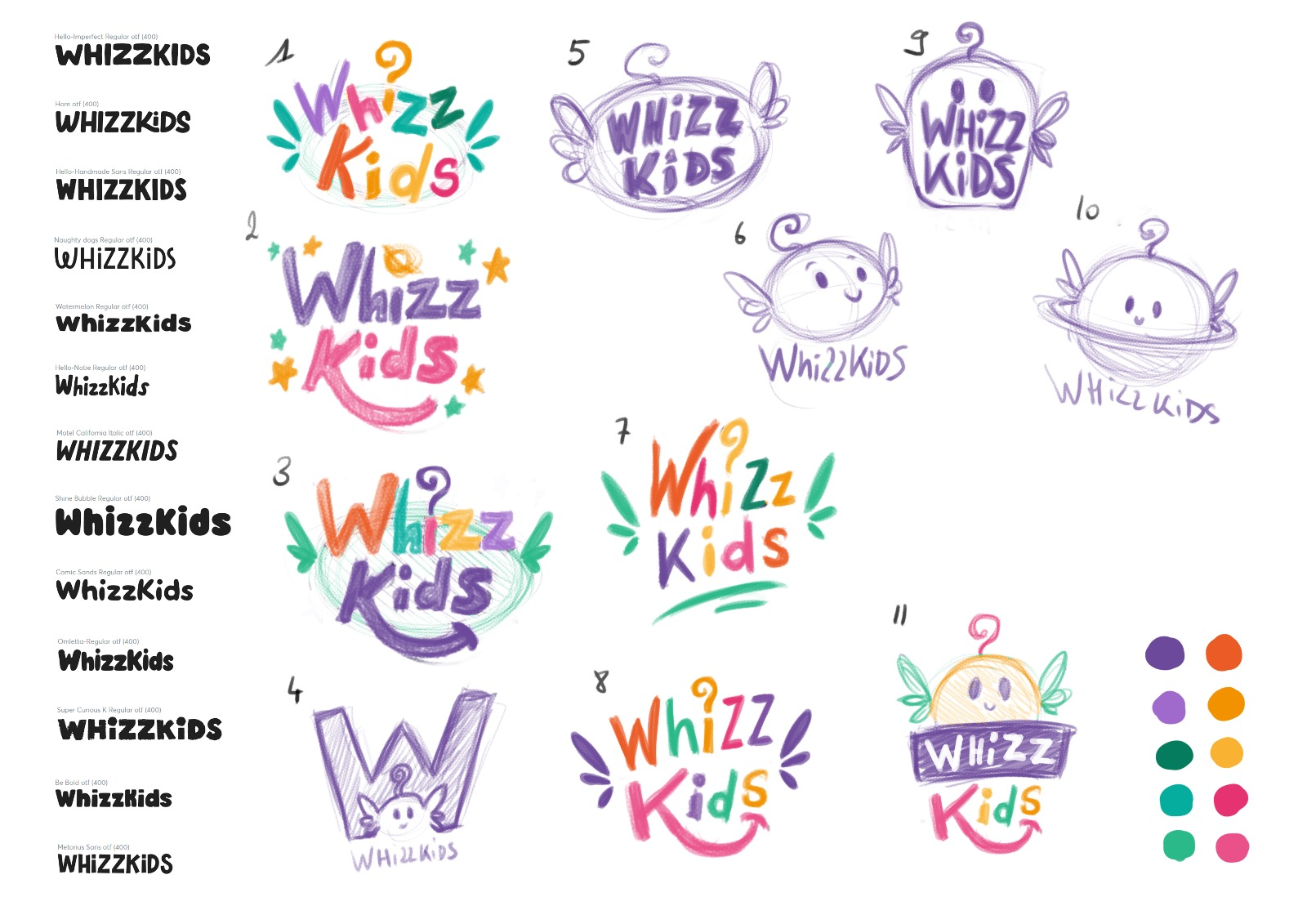
First new logo sketch
Since they were busy brainstorming a new name, I got to work on some new logo sketches. I offered a wide variety of fonts to choose from, along with a fun new color palette featuring bright colors for kids. The sketches mainly focused on the “Whizzies,” as they could become the new recognizable faces of Whizzkids.
In the meantime, they asked for more variety in the Whizzies, so I made some additional sketches.
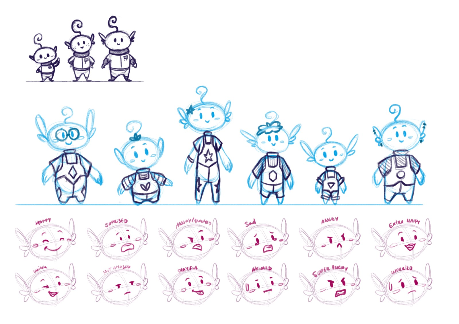
More ‘whizzies’ sketches.
I had a fun meeting with the team to come up with a new name together. We tried several different names and mainly checked whether they were already in use, if the domain name was still available, or if it would be too expensive to buy (since this is still a non-profit organization with a tight budget).
Out of this brainstorming session, the name ToDi was born: a mashup of “Together Digital” — a sentence that perfectly captures what Whizzkids stands for.
After some reconsideration and asking for feedback from their current audience, Whizzkids decided to keep their original name. The name ToDi would instead be used for the mascot.
The mascot concept also changed. Having multiple mascots felt like too much, so we streamlined it to one central mascot.
They wanted the brand to focus more on these concepts:
Technology
Ecology
Digital spaces
So, it was back to the drawing board!
Todi exploring sketches.
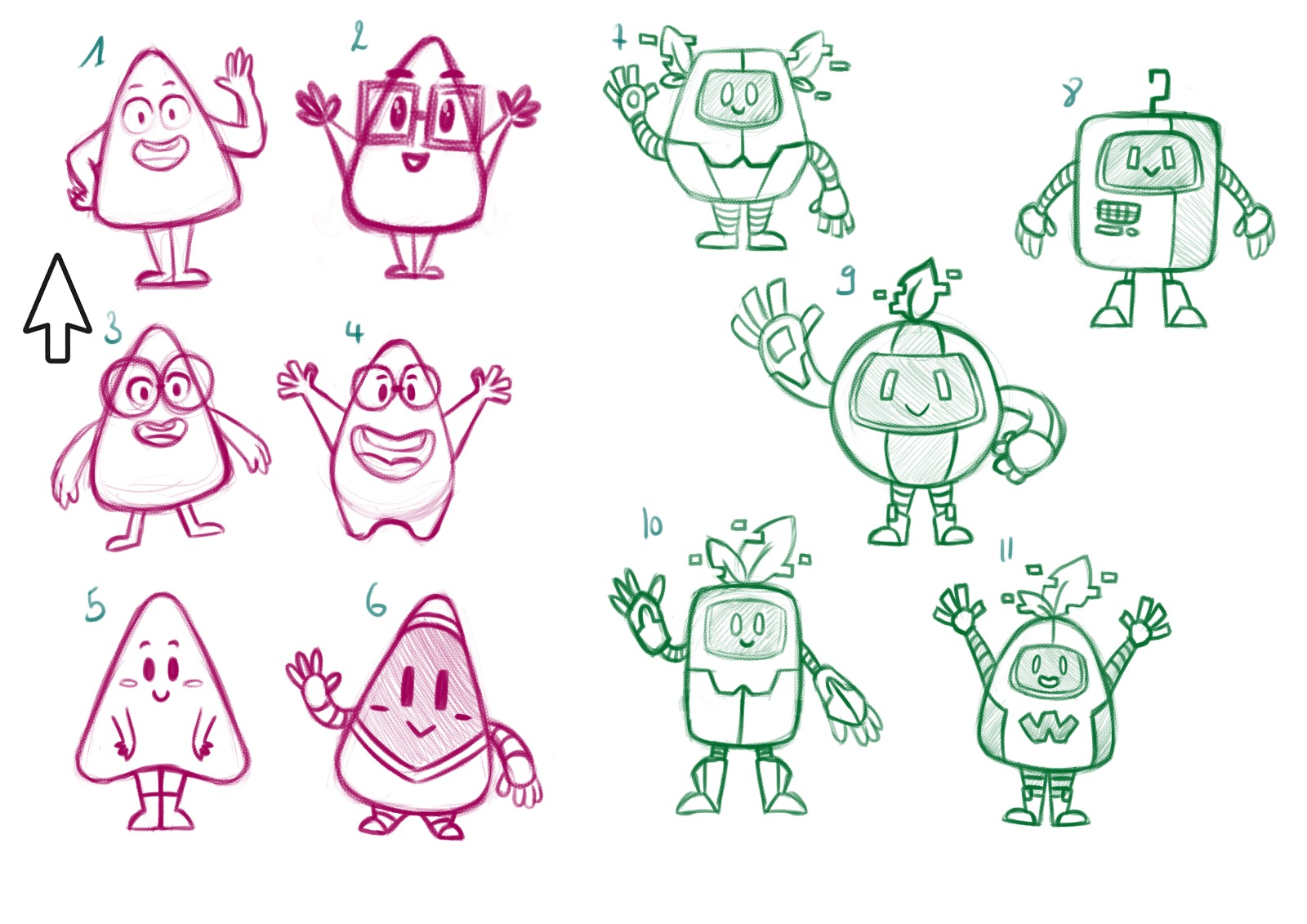
New ideas began to form. I started thinking about computers and what the most unchanged and recognizable design element is that hasn’t changed since the beginning of the digital age. I landed on the cursor. (I remember you could download funky designs for it in the ’90s and early 2000s, but that never really took off.)
With that in mind, I focused on the triangle shape of the cursor. I also made some fun robot designs, since robots are strongly associated with technology and the internet.
Whizzkids thought the idea of combining the cursor and robots was fun, so we merged them together. They chose sketch no. 11, and I refined it by making the next version slightly more triangular.
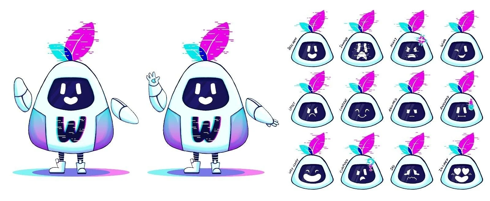
Todi getting his final form
Now that we had a fun mascot, it was time to refocus on the logo design for Whizzkids. Since ToDi was a little robot with some glitchy leaves on his head, I tried to create a logo that matched his vibe.
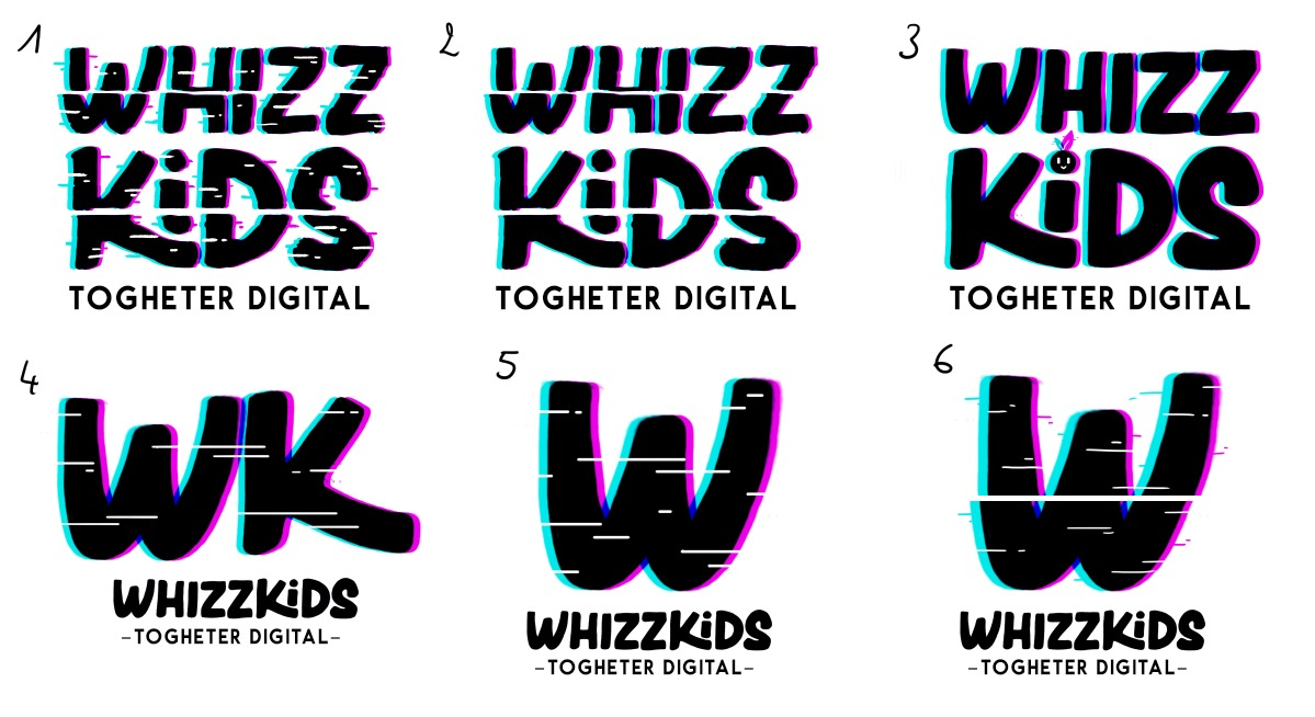
First few interactions of the new logo
For the new Whizzkids logo designs, we chose a fun new font that perfectly matched the vibe we were aiming for. It is very readable and playful without being too childish. I also added some glitch effects to highlight the digital aspect of the brand.
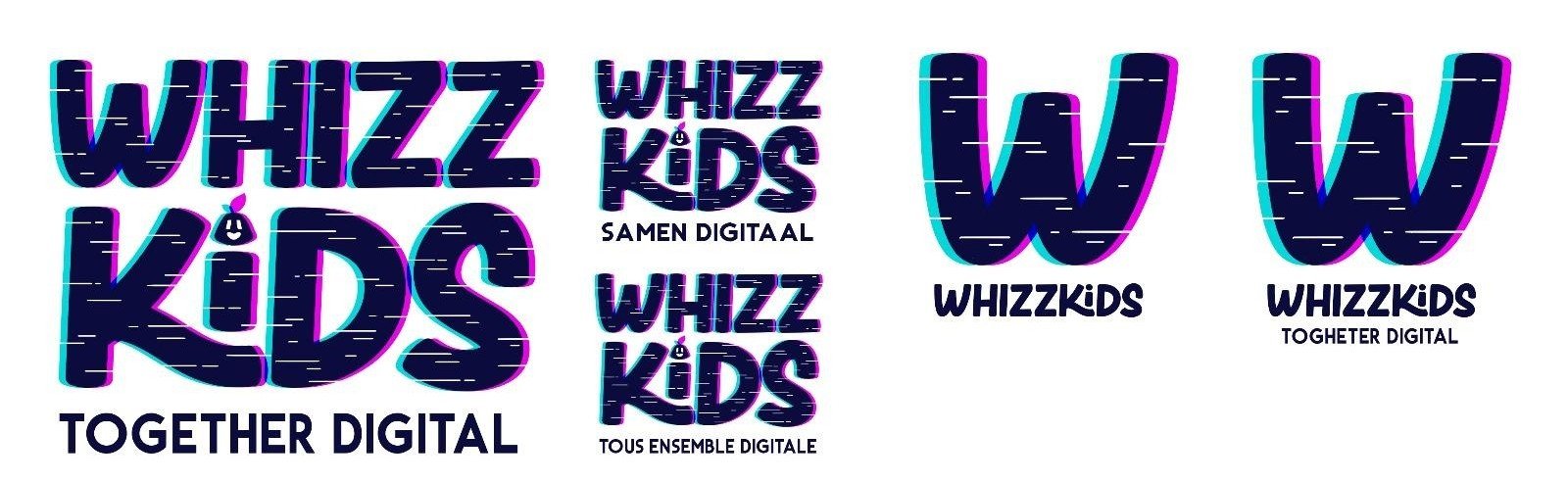
Final design logo
After the first round of logo designs, the Whizzkids team chose this one. The dot on the “i” is shaped like ToDi, giving a fun nod to our new mascot.
The client was concerned that the colors might be too close to TikTok’s branding, so we explored some alternative color options.
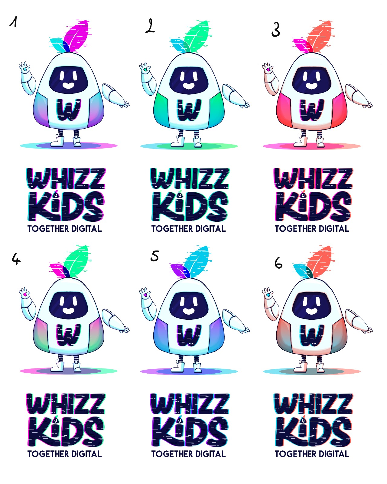
New color suggestions
Whizzkids chose option number 5. They liked the blue and purple tones, as these reminded them of digital space and technology without feeling too TikTok-like. The colors also gave the logo a softer look.
The only remaining feedback was that the black felt too dark, so I adjusted it to a dark blue. This change made the logo feel much lighter and less heavy overall.
I was also asked to redesign the website, but that’s a whole other story you can read about here.
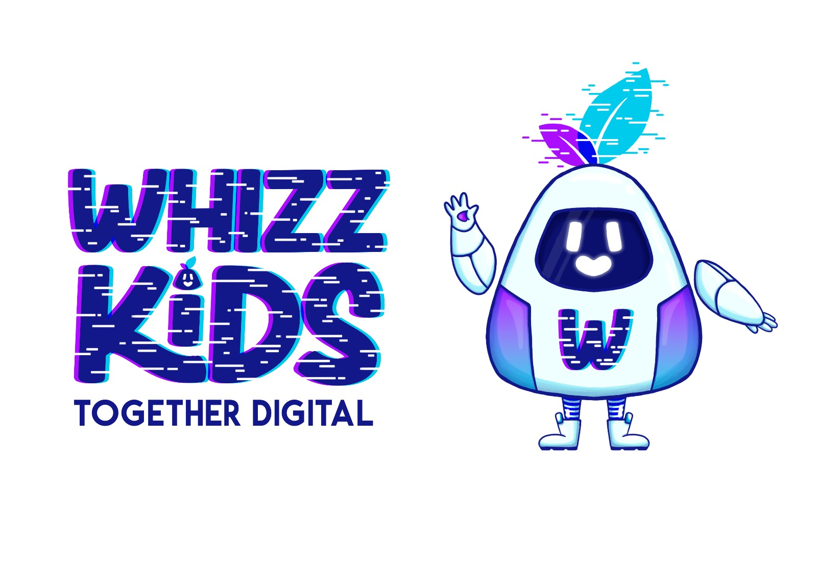
The absolutly definitely final logo!
Now, the most exciting—and terrifying—moment had arrived: the public reveal of the new brand!
Whizzkids unveiled their new mascot and logo at the finals of the 2024 quiz, in front of all the kids and schools.
Kids can be fair but harsh critics, so Whizzkids invited me to the event. I was seated right next to my target audience to experience the rebrand reveal with them. I was both excited and nervous. I had created a cute little animation to announce the rebrand: the video showed ToDi popping out of the screen and presenting the new logo.
When the animation played on the big screen, the kids went wild! I hadn’t expected such a huge reaction, and it was incredibly gratifying and humbling to see my work have such an overwhelming impact. This was truly a highlight of my career.
This was such a fun and creative journey to work on this rebrand. It was a rewarding challenge, and I loved collaborating with the Whizzkids team. They were very enthusiastic and open to working together. They even invited me to events so I could fully understand their work and experience it firsthand. This gave me a solid understanding of what Whizzkids is all about, and I feel that effort really paid off in the final designs.