Whizzkids Ux/Ui design
After completing the Whizzkids rebrand, they asked me to redesign their entire website. The existing site had originally been built in the ’90s, and over time new pages were continuously added without rethinking the overall structure. While the content itself was valuable and relevant for schools and teachers, it was buried under layers of links, subpages, and outdated navigation. Finding the right information often felt like navigating a labyrinth.
Step 1: Understanding the Problem
Before designing anything new, I dove into the existing website. I mapped out every page, noted what information was still relevant, what could be shortened, and what could be removed altogether. This gave me a clear overview of the site and helped identify the core problem: there was too much friction between the user and the information they were looking for.
The key insight was simple but important: Whizzkids is all about competitions and educational tools. These needed to become the heart of the website.
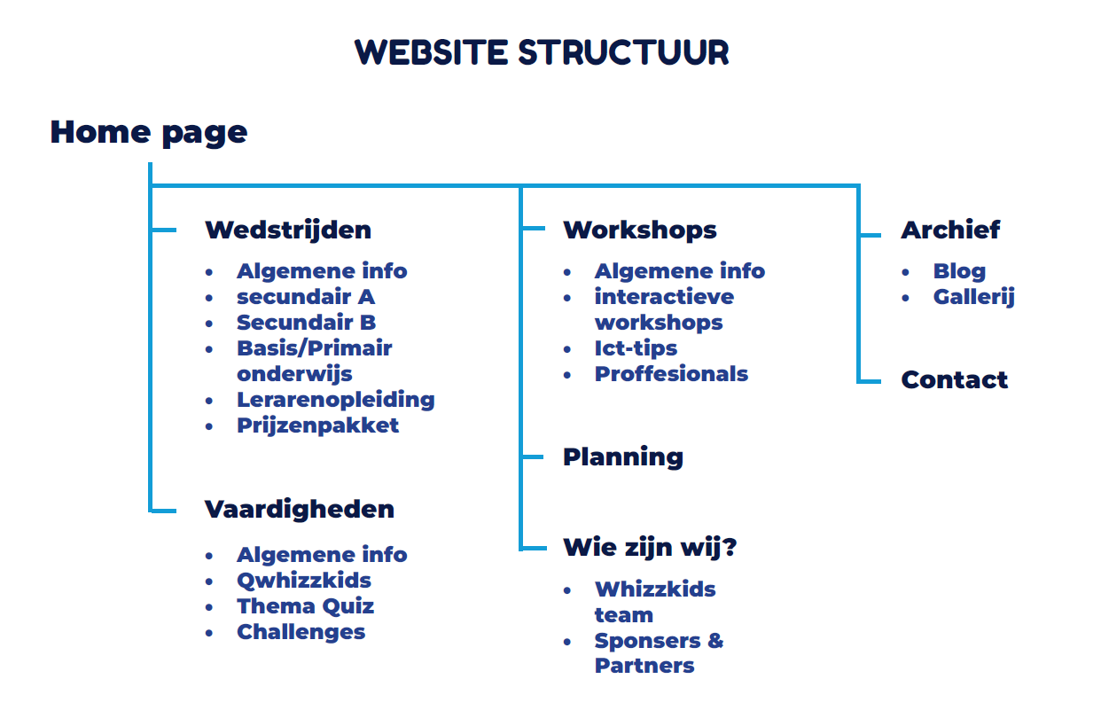
the website structure
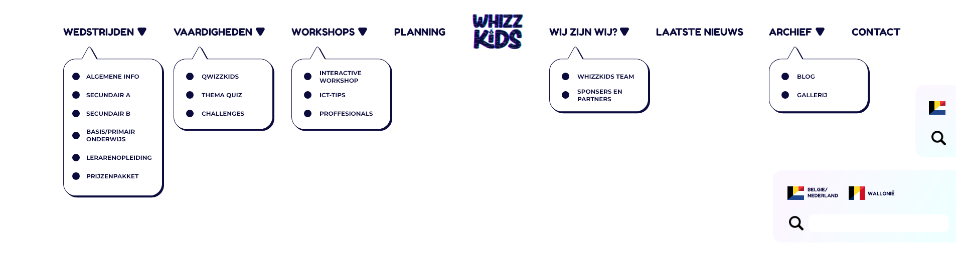
The website navigation bar
Step 2: Rebuilding the Structure
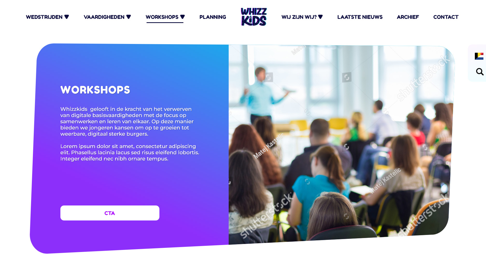
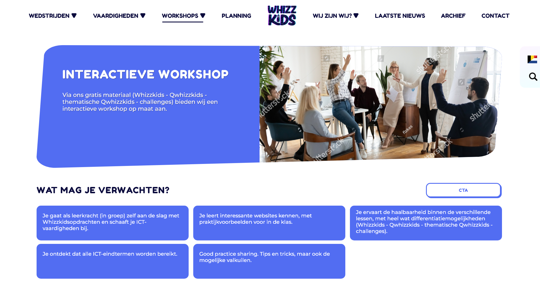
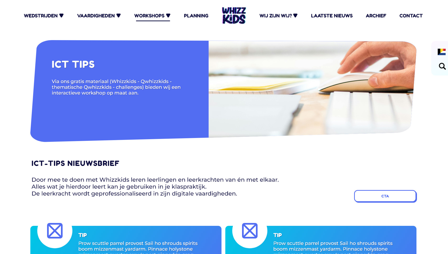
Once the content was mapped, I rebuilt the website structure from the ground up. The main navigation was reduced to clear, logical sections: competitions, skills, workshops, planning, information about Whizzkids, archive, and contact. Each section had a clear purpose and a specific target audience in mind.
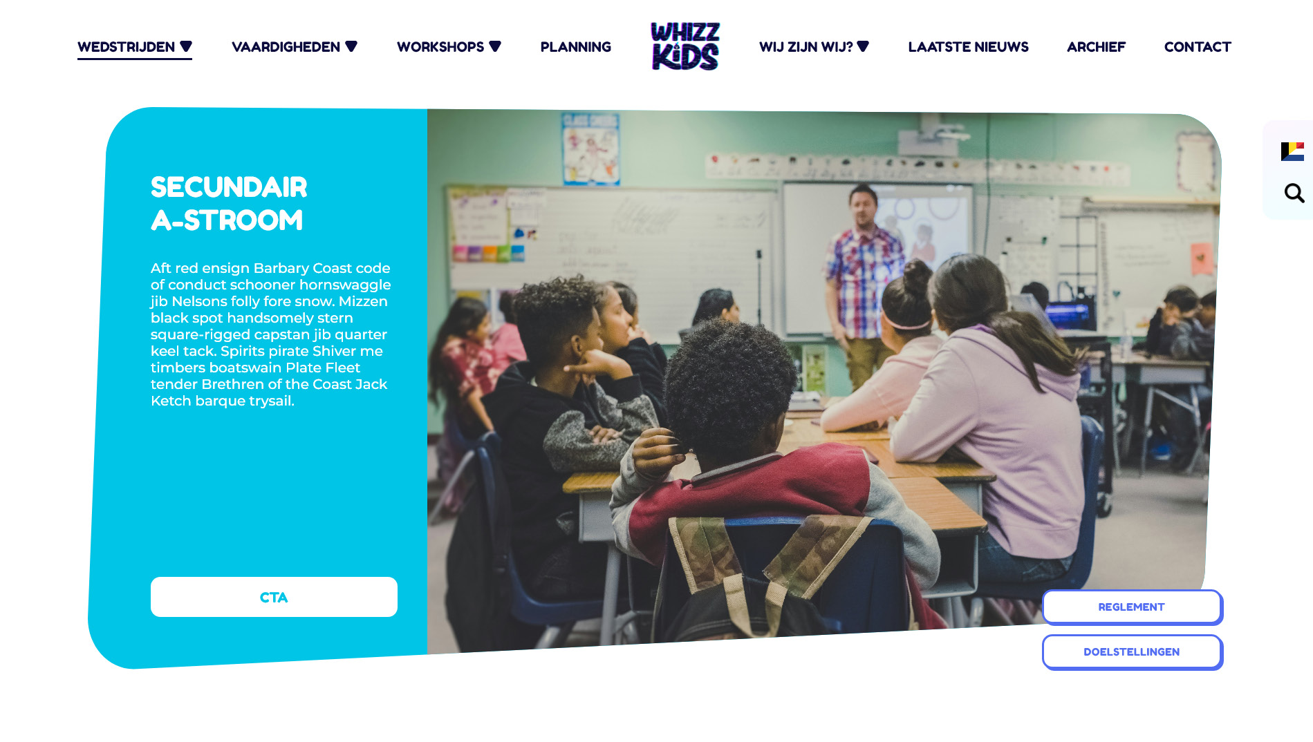
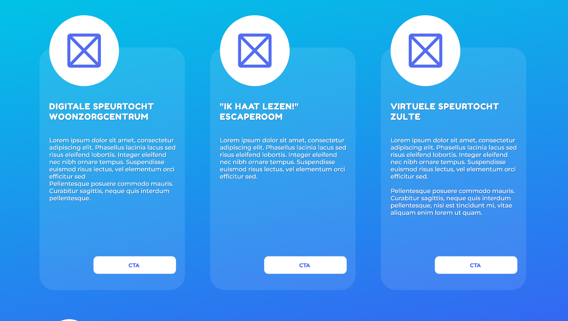
Competitions were divided by target group (primary school, high school, and student teachers), each with its own color coding, planning, and participant overview. This made it immediately clear where users were and what content applied to them. Skills and workshops were structured so teachers could quickly find lesson materials, ICT tips, or professional training without unnecessary clicks.
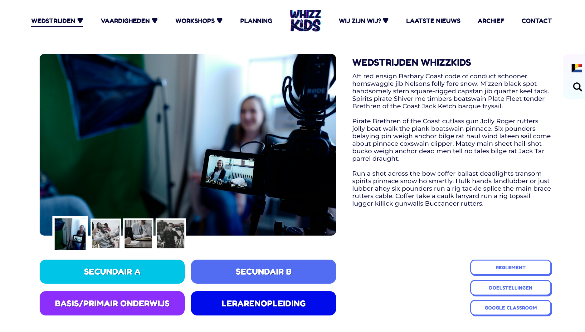
The main page for competitions witht the clear color coding for the target groups.
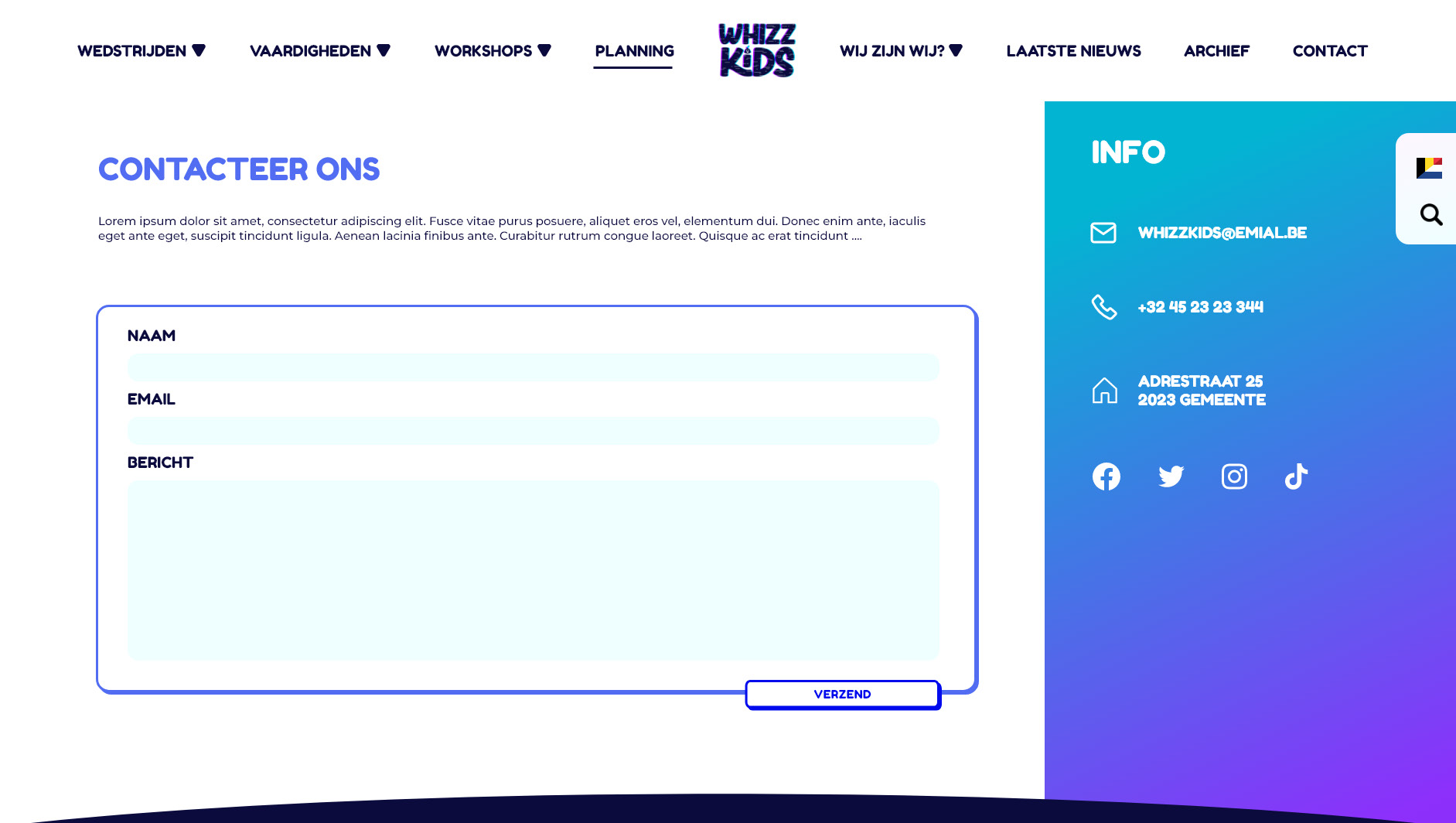
Step 3: Designing with the User in Mind
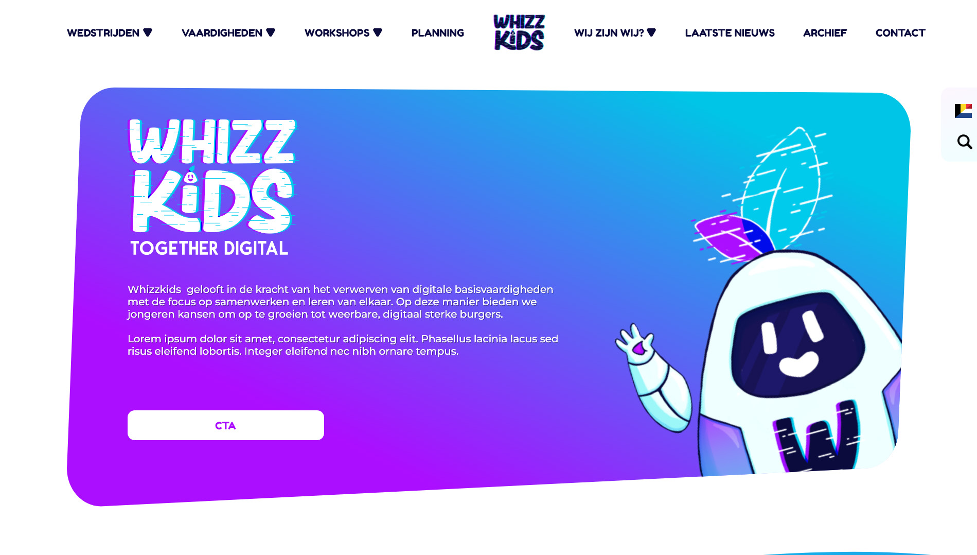
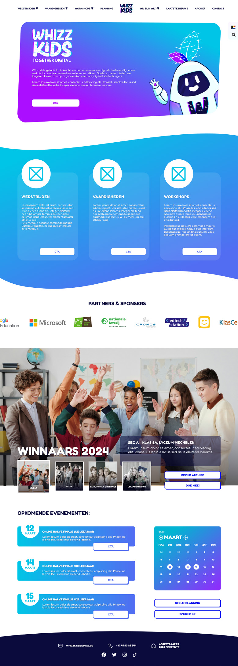
With the structure in place, I moved on to wireframing and layout design. The homepage was designed to instantly answer the question: “What is Whizzkids and what can I do here?”
Clear calls-to-action guide users toward competitions, skills, or workshops, while secondary content like archives and blog posts remains accessible without cluttering the experience.
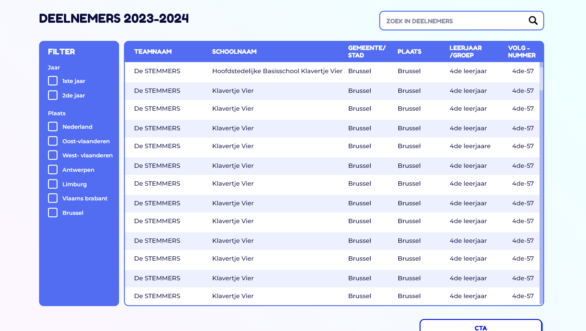
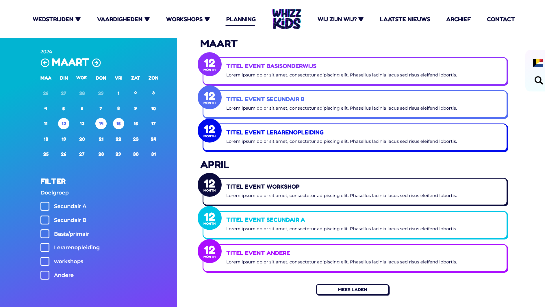
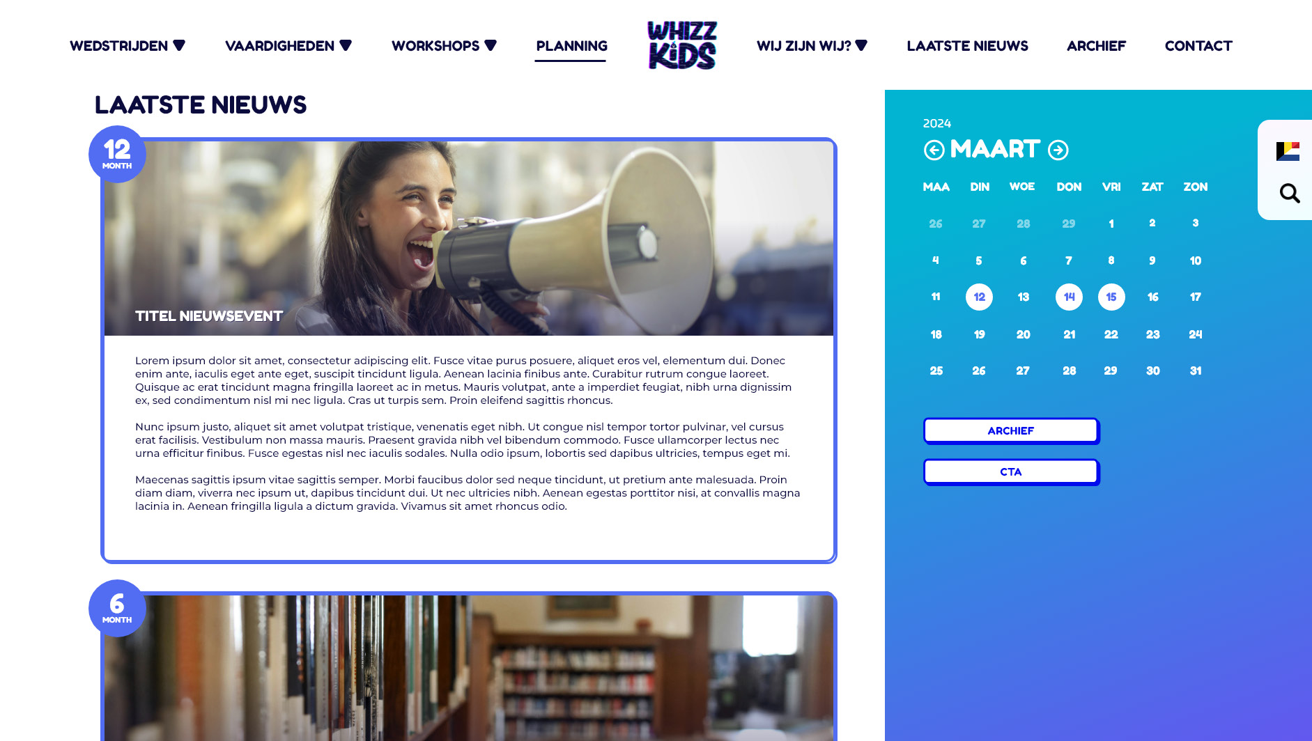
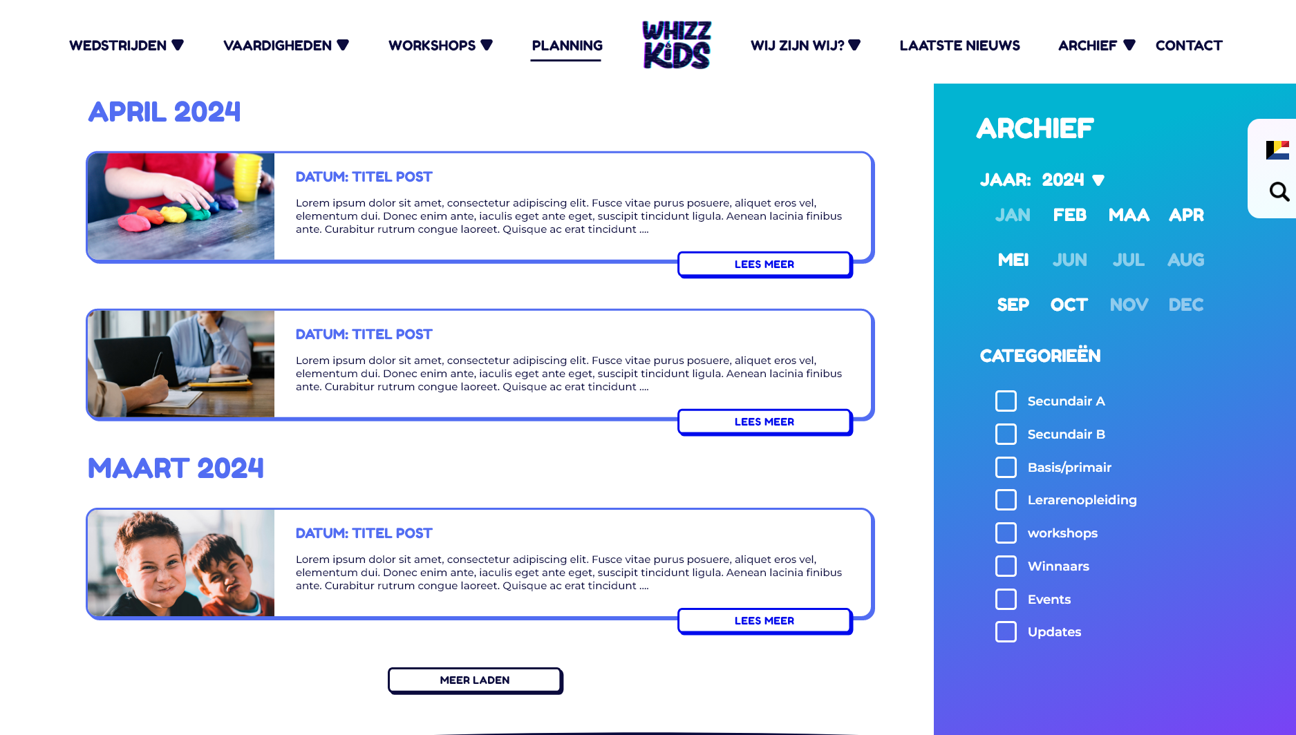
The calendar plays an important role throughout the site, giving users a quick overview of upcoming competitions and events. Filters, search functions, and expandable sections were added to reduce cognitive load and help users find exactly what they need.
The design for the home page.
Step 4: Visual Design & Branding
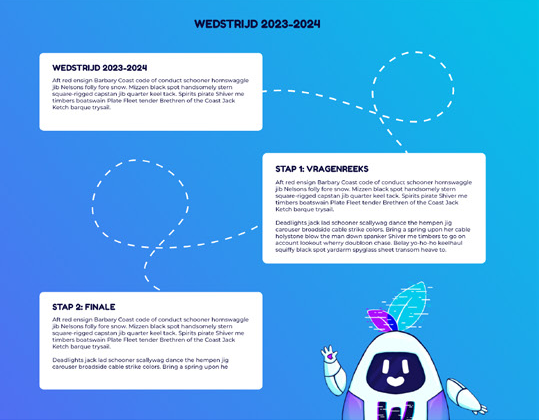
The visual design ties directly into the new Whizzkids brand. The ToDi mascot appears throughout the site as a friendly guide, helping users through steps and explanations without feeling intrusive. Bright colors, rounded shapes, and subtle glitch effects reinforce the digital and playful nature of Whizzkids, while keeping everything readable and professional.
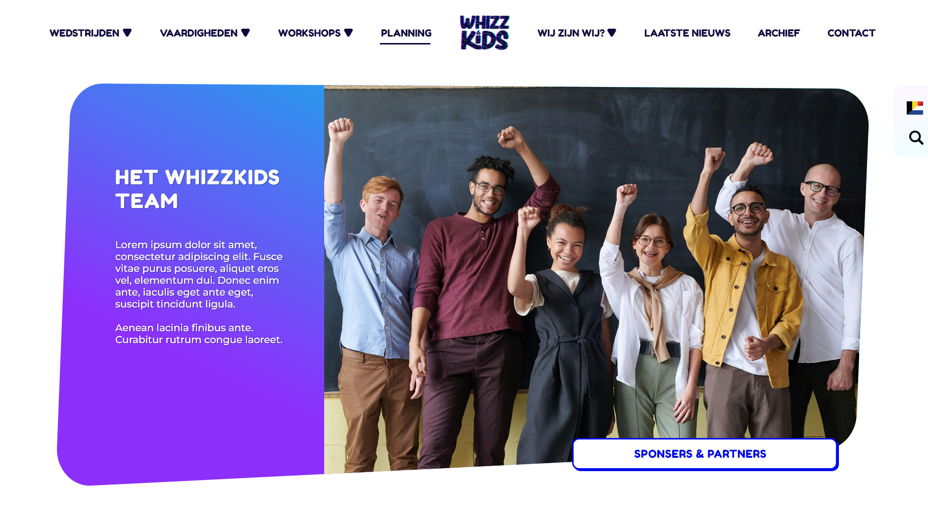
Sponsors and partners were given a prominent place on the site, both to acknowledge their support and to make collaboration opportunities more visible.
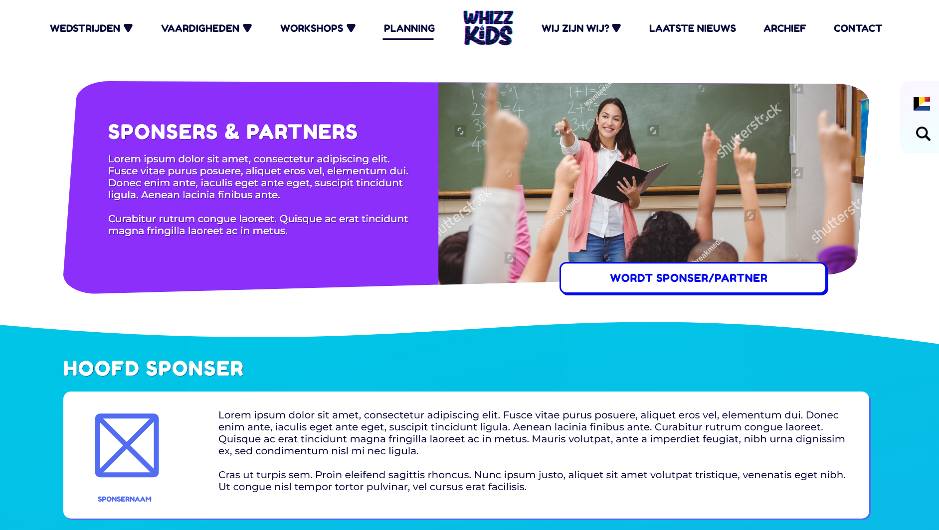
The sponser/partner page header with cta to become a sponser/partner.
Step 5: The Result
The redesigned website transformed Whizzkids’ online presence. What was once a cluttered and overwhelming experience became a clear, intuitive, and engaging platform for teachers, schools, and students. Important information is now easy to find, competitions are front and center, and the overall experience feels aligned with the new brand identity.
The result is a website that supports Whizzkids’ mission: learning together, digitally—without frustration, confusion, or endless clicking.
A note on implementation:
Unfortunately, due to budget and time constraints, the full website design was not implemented. However, the complete structure and content strategy I developed were used as the foundation for the new Whizzkids website. This ensured that the most important improvements—clear navigation, better information hierarchy, and a user-focused structure—were still carried through, even without the full visual redesign.