

Stripbib: A proposed rebrand and website redesign.
For Stripbib, a local comic library run by passionate volunteers, I worked on a complete rebrand and website redesign as a volunteer project. The goal was to give Stripbib a visual identity and digital presence that better reflect the warmth, creativity, and accessibility of the library itself.
Rebranding & Visual Identity
I started by refreshing the visual identity of Stripbib. The existing branding no longer fully matched the welcoming and creative atmosphere of the comic library, so I aimed for a look that feels modern, friendly, and instantly recognizable.
I redesigned the logo using bold, rounded shapes inspired by speech bubbles and comic lettering. The color palette mainly consists of calm blue tones, keeping the identity simple, approachable, and easy on the eyes. The blue also reinforces a sense of calm and trust, making the brand inviting for readers of all ages.
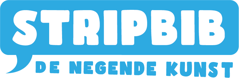
New logo stripbib
To further bring the brand to life, I illustrated a new comic book character that Stripbib can now use as a mascot. This figure represents curiosity, reading, and discovery, and adds a human, playful layer to the brand. The mascot can be used across the website, social media, and future communication, making Stripbib feel more personal and approachable.
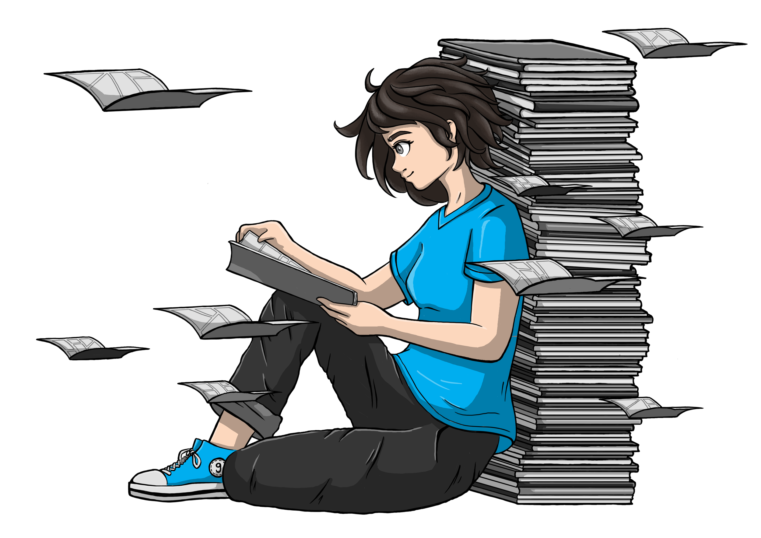
Main illustration of the new comic book character for stripbib
The Challenge
Alongside the rebrand, the website itself needed a complete rethink. The existing site had grown organically over time and had become difficult to navigate. Important information—such as opening hours, the collection, and activities—was available, but often hard to find.
The challenge was to:
make essential information immediately visible,
create a clear and logical structure,
and design a website that feels welcoming, playful, and easy to use.
Research & Structure
Just like with the Whizzkids project, I started by analyzing the existing website and mapping out all content. From there, I restructured everything into a clear and intuitive information architecture focused on user needs.
The homepage was designed to give visitors an instant overview of Stripbib, featuring opening hours, address, a short introduction, latest news, new comics, and a clear call for volunteers.
The navigation was rebuilt into clear sections:
Practical – contact info, rules, pricing, and location
Collection – the full comic library with filters for easy browsing
Activities – upcoming events and a calendar overview
News – updates and announcements
Podcast – space for Stripbib’s audio content
Archive – past events and the history of Stripbib
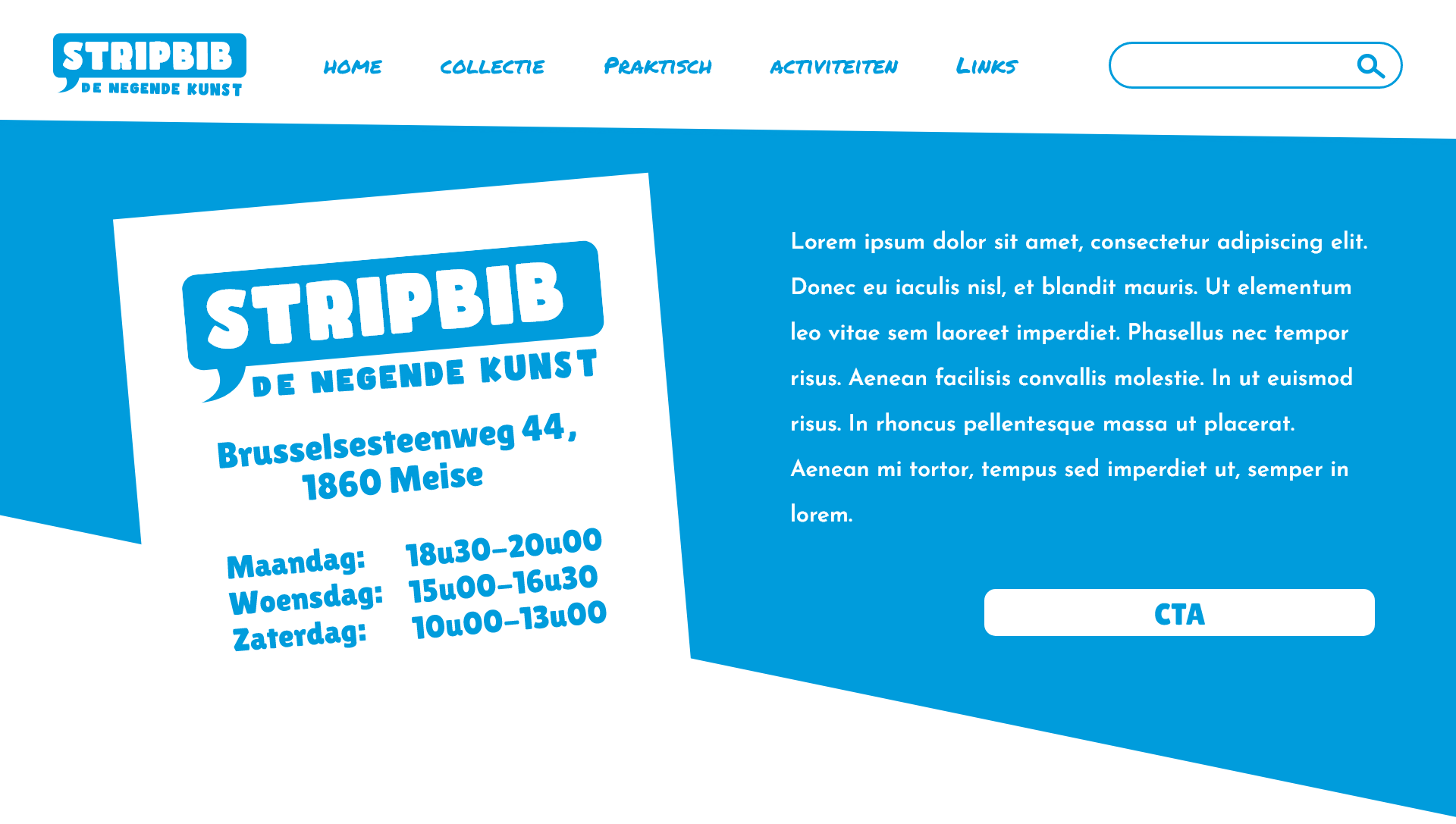
Stripbib homepage header
UX & Content Flow
Each section was designed with clarity and readability in mind. News items and events link to detail pages, the collection encourages discovery through filters and related suggestions, and clear calls-to-action guide visitors toward volunteering or exploring the library.
The visual language from the rebrand carries through the website, creating a cohesive experience between brand and interface.
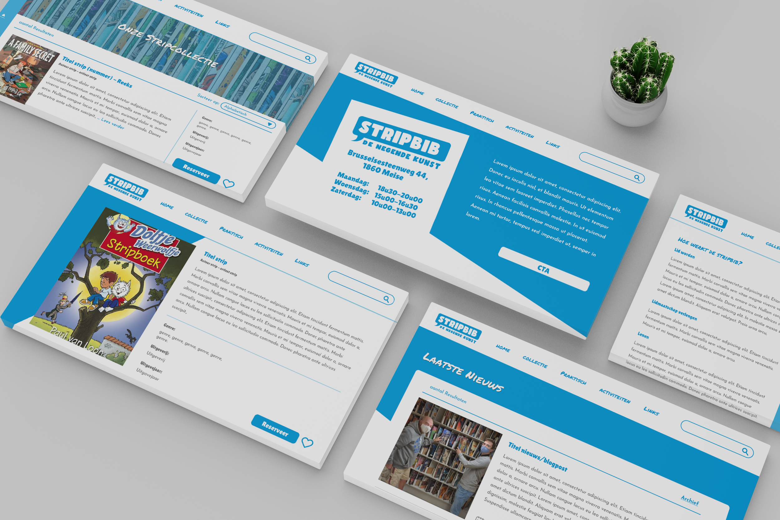
Quick overview of the website design
The Result
The final concept combines a refreshed brand identity with a clear, user-friendly website structure. Stripbib now has a visual and digital foundation that reflects its values: accessibility, creativity, and community.
A note on implementation & learning
This project was created as a volunteer-based rebrand and website redesign proposal for Stripbib. While the structure, branding, and design concepts were well received, the final website that went live was further adapted internally and does not fully reflect the proposed design.
That said, this project was a valuable learning experience. It strengthened my skills in content analysis, information architecture, and translating a cultural organization’s identity into a clear digital structure. It also offered insight into working with volunteer-driven organizations, where time, resources, and long-term ownership can strongly influence final outcomes.
The work shown here represents my original concept, UX structure, and visual direction, created to demonstrate a thoughtful, user-focused approach to Stripbib’s digital presence.